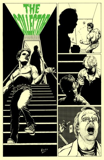
HOW TO DRAW COMICS:
INKING WITH A BRUSH pt 17
Continuing the real-life saga of one man’s struggle against his art materials!
Is it always necessary for backgrounds to contain less detail than foregrounds?
The answer to this, of course, is no. It all depends on the effect you are trying to achieve in a particular panel. If you want a background to recede in space in the manner of aerial perspective — as discussed last week — it usually helps to reduce the amount of detail in the background.
Sometimes, however, increasing the amount of detail can actually make an area recede.
Let’s say you draw the many individual hairs of a fur skin — all having the same length, thickness, and direction — so that when looked at from a normal reading distance the fur appears to take on a single tone. Though you may have spent hours drawing in every detail, in the end the area appears as little more than a grey tone that will tend to recede behind any nearby object with higher contrast and, in this case, fewer details.
The important thing to consider here is contrast. The use of detail, when it creates contrast to other areas around it, will attract a viewer’s attention. It is contrast, not detail, that draws a reader’s eye.
So what, exactly, do you mean by contrast?
When working in black and white, adjacent areas that differ the most in value almost always command the greatest attention. Black type on a white page. The black pupil set against the white of the eye. A black silhouette against a bright window. An explosion in the night sky.
Wherever a significant amount of black and white are set off starkly against one another, this is where your eye will surely look. Think of the spotlights in a darkened theater: your eye is naturally drawn to the highest contrast in the room.
As the value difference between two neighboring regions is reduced, to say a dark grey against a light grey, the attention demanded by that area tends to decrease accordingly, until the two values are indistinguishable and the area becomes wholly uninteresting to the eye (unless of course this new area now comes into contrast with another adjacent area).
In addition to value contrast, there are other contrasts that are also important in graphic work, particularly inking. Contrast between line direction, smooth vs. rough lines, continuous vs. broken lines, thick vs. thin lines, fixed-width vs. variable-width lines, straight vs. curved lines, and line thicknesses: all these contribute more or less to drawing a reader’s attention and leading the eye across the page.
And this is the ultimate goal of the artist as storyteller: to capture your reader’s attention, draw them in to your story, and move them from moment to moment (both within and between panels) at a pace you dictate.
Contrast helps to achieve this.
Next Wednesday: I’ll talk about spatial layers and contrasts in: Inking with a brush part 18!
Wednesday, November 11th, 2009


